Quantcast
Channel: Pages from my moleskine
Viewing all 82 articles
Browse latest View live

guest post by chloë antonio: aesop, attention to detail

$
0
0
Hello! I’m Chloë, a graduate architect new to the blogging world, I’m a daily list maker with a serious Pinterest addiction and I am always working on something new. Currently that is my new blog – Lines of ArchitectureThrough my love of discovering blogs, my frequent Pinterest habits and Instagram stalking, I have made new e-friends, Ella being one of them, which is how I have come to contribute this post to her fabulous blog. Thank you Ella for the opportunity!

Recently Ella wrote about the new direction of PFMM and the importance of being in and experiencing a space with all your senses rather than just being consumed by the images. This is something that resonates with me and, while I still see much value in the image of architecture and design, (as seen by the regular activity on my Pinterest) nothing compares to being within the space and feeling and seeing the qualities - minus the edited lens of the camera. With that in mind, I wanted this post to be about spaces that I, and perhaps you, have been in. While not unveiling anything new or “current” this post might allow you to contemplate your own experiences.


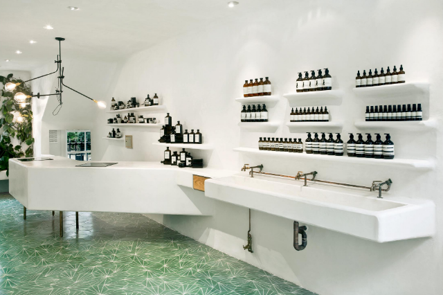
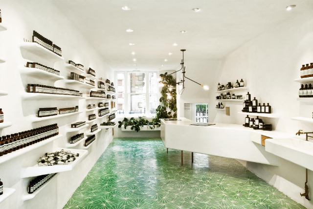
Aēsop is a brand synonymous with design. What makes Aēsop unique is their attention to design and detail on every level. The whole brand has been considered from the typography to the minimalist packaging, to the quality of the staff working in the stores and the continual engagement of quality architects to create new and unique retail spaces all over the world. An interview with the founder Dennis Paphitis expands upon the history and design direction of the brand and is well worth a read. 

The retail stores are each unique, yet unified in their ability to reflect the brand. While often working with architects several times, the stores never end up conforming to a single idea – each responds to the place in which it is located.

Aēsop has recognised the importance of appealing to all the sensory properties in their retail stores. The stores lure you in with their gentle botanical scents, their warmth and soft lighting. And while the interior architecture is very photogenic, the total experience can only be had by stepping into the store yourself.


The Greville Street, Prahran store (2010) by March Studio has two retail facades – one that fronts the eclectic, vibrant Greville Street and one that addresses the laneway of Grattan Gardens. For this reason, the interior is much more light-filled than many of Aēsop’s other stores.

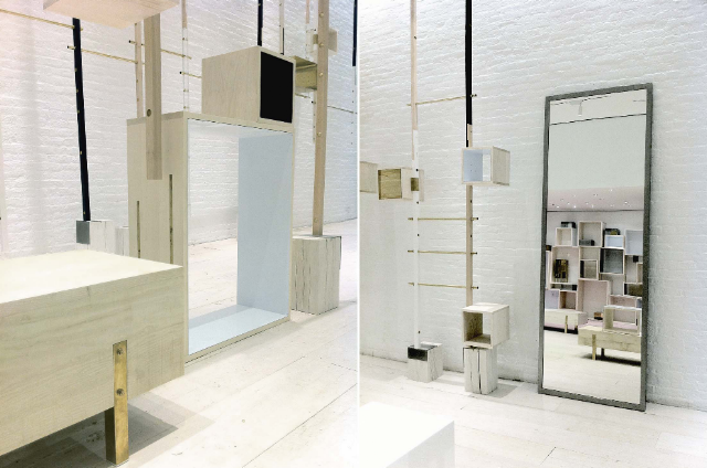
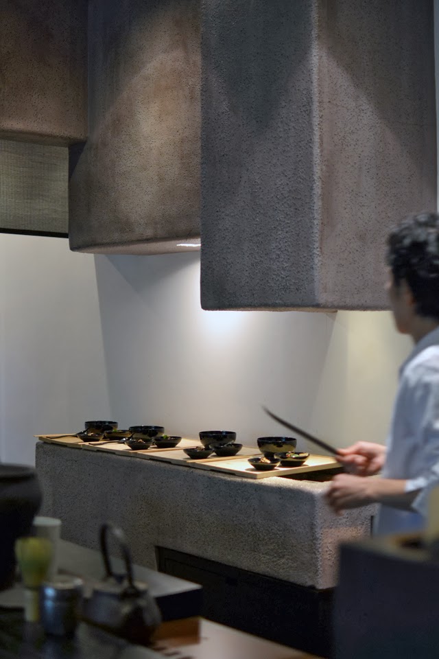
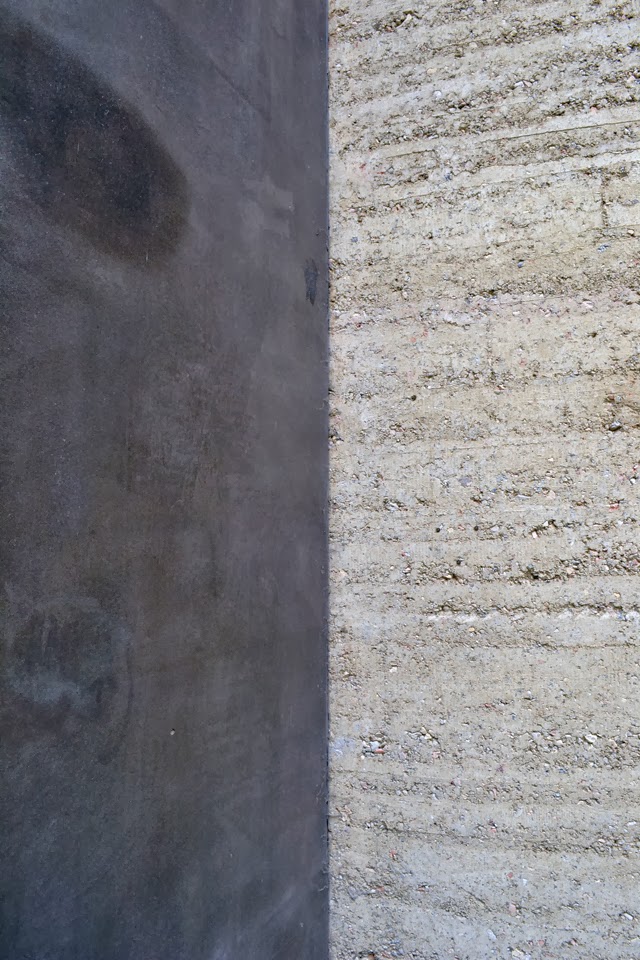
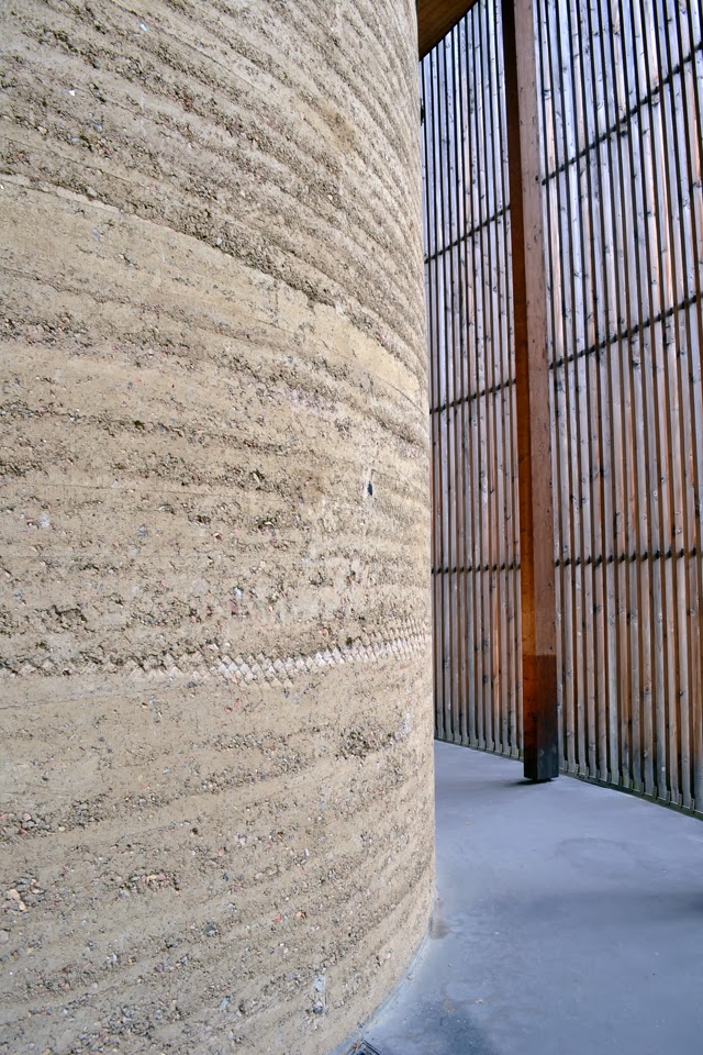
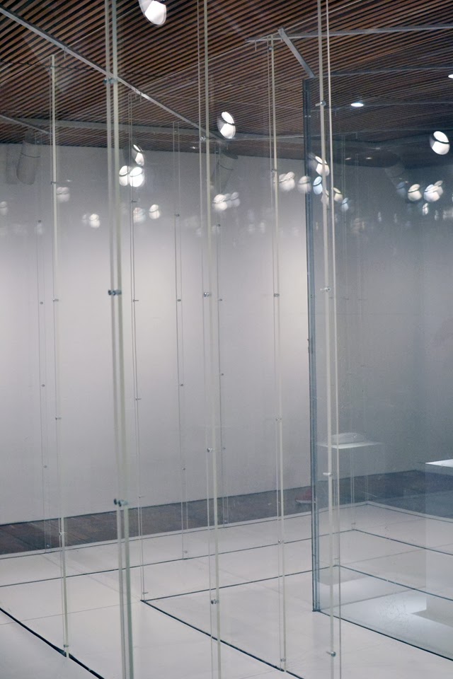
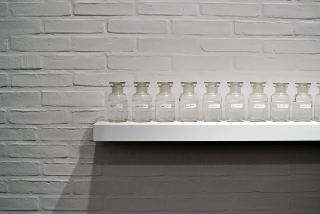
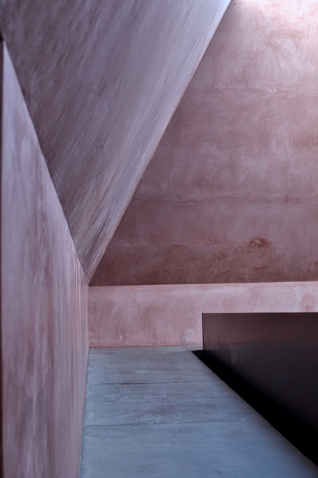
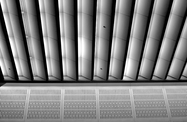
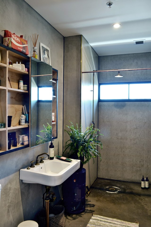
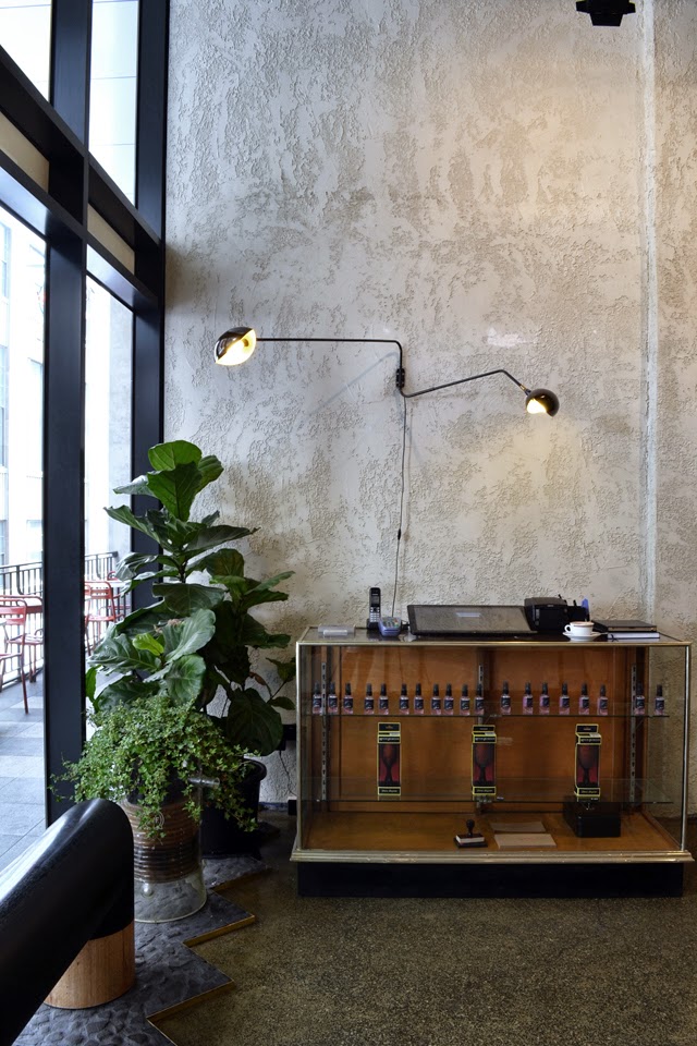
March Studio has designed over 12 stores globally for Aēsop and tends to use a single material in their fit outs; copper, stacked card, ply, cork. The Greville Street store, made entirely from ply, explores variance and texture through an interlocking, repetitive system to create shelves for the range of Aēsop products. The use of a raw, repetitive, uniform material manages to create a space where
the products become the focus while the warm, tonal material recedes. 


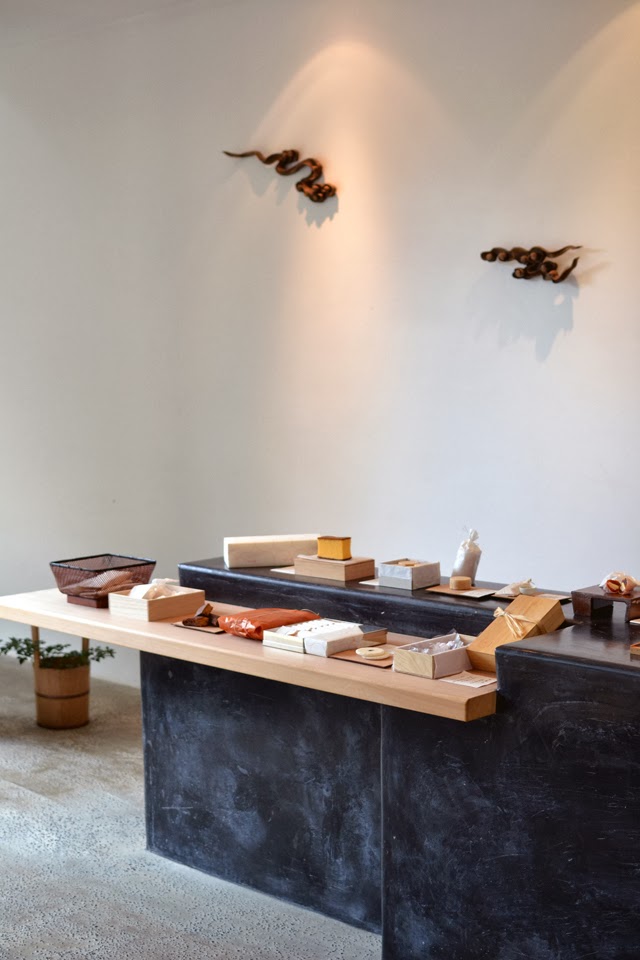
On Greville Street the products can be tested with the assistance of very helpful staff in a moulded ply sink. Upon payment, the counter exposes the hidden register, sample drawer and printer. A linen bag is sprayed with a gorgeous botanical scent and then brought around the desk by the staff and handed to you (all of this effort making you feel much better about spending your money!). Very clever. 


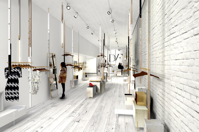
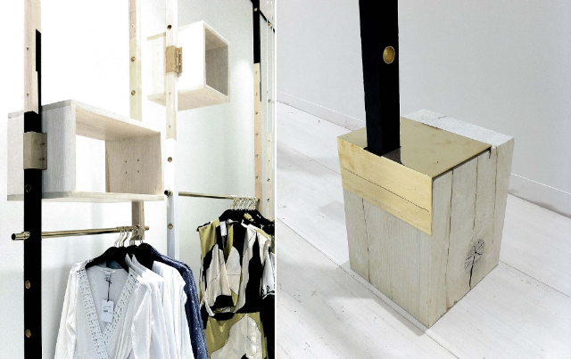
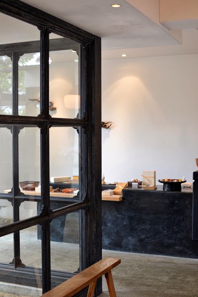
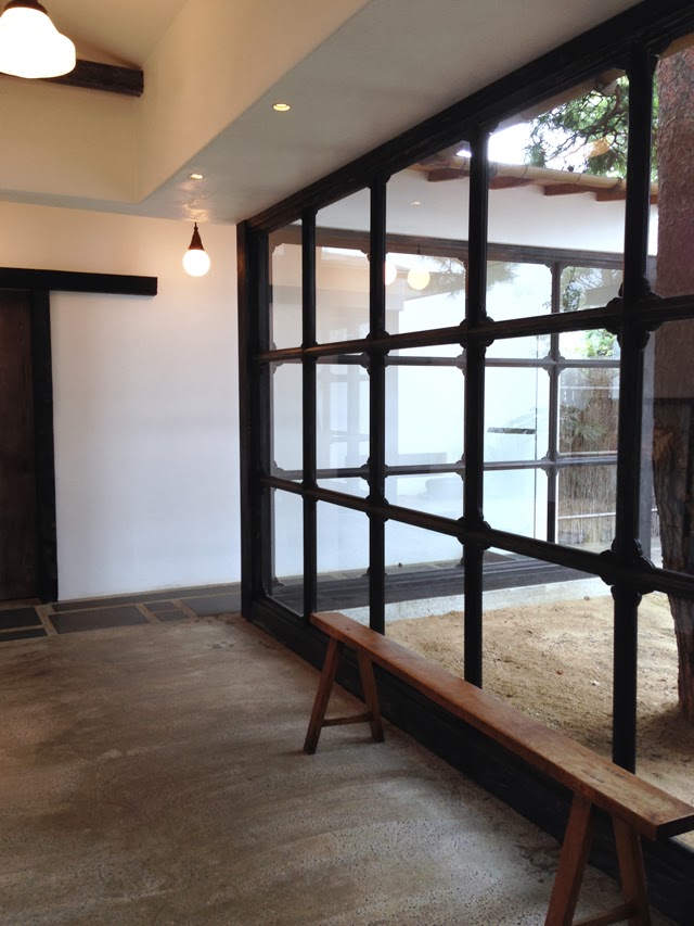
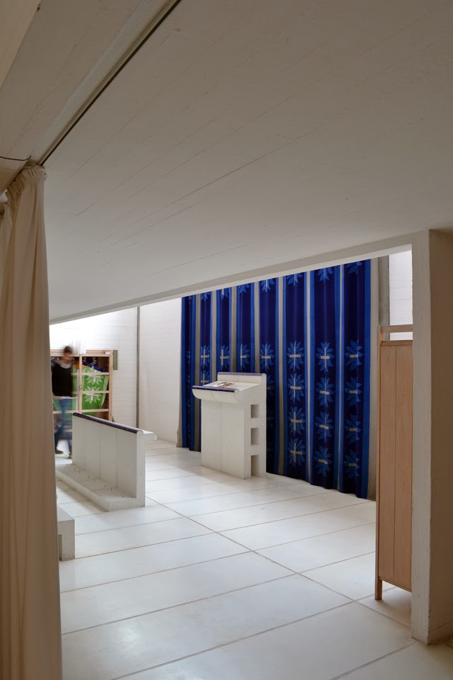
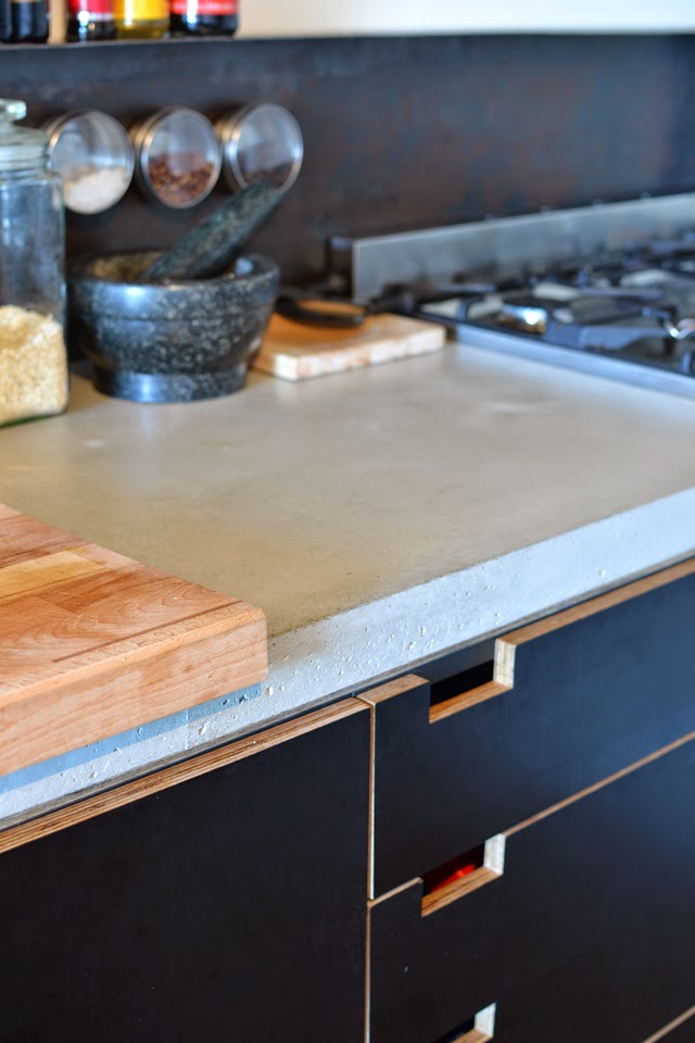
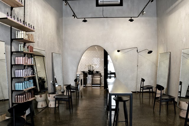
The Collins Street store (2012) by Kerstin Thompson Architects is one of more than six by the architect for Aēsop. The inner city location of the store is situated right in the heart of the men’s district. The store-front belongs to the Gentleman’s Athenaeum Club and is surrounded by other men’s retail. An interior fit-out that reflects this masculine identity of the top end of Collins Street is what has been produced. The store is much more hard-lined than Greville Street with mild steel framed cabinets with copper shelves and brass fixtures. 


The images here, from the architects websitewere taken at night and lend to a more intimate environment where the fixtures glow in the soft artificial light. However, in the daylight the space is not quite as “romantic” as this (unfortunately no photos were able to be taken) and did not have the same glow. 

The masculine aesthetic is also evident in the product testing area, which is composed of a mild steel sink and vanity, complete with black fittings. Three dark tinted mirrors complete the vanity ensemble that feels like it belongs in the dressing room of a well-to-do gentleman’s home of old. The leather curtains that hide the back of house create a theatrical like space so you feel like you are on the set of a play in said gentleman’s dressing room. This store in particular has a strong integration with its unique place on Collins Street.


Each Aēsop store feels like a calming retreat in comparison to the clinical glare of the typical beauty store. Do you have a favourite Aēsop space?

Thanks for reading my first ever blog post and a big thank you to Ella for inviting me to share this story with you. I think she took a leap of faith, considering we haven’t actually met (yet) - in the real world!

Text, sketch and photographs by Chloë Antonio for Pages from My Moleskine.
[Collins St Interior photos by Trevor Mein via Kerstin Thompson Architects]

guest post by jenna rowe: ciguë architects

$
0
0
Hello, it's me Jenna. Ella has once again handed me over the keys to her blog while she is off gallivanting in Berlin, Copenhagen and Japan. For those of you who follow her Instagram account; you would have seen some absolutely beautiful photos of her trip so far. Fortunately for us - Ella has her DSLR with her, and from what I have heard so far we are in for a treat when she gets back!

Following on from the lovely Chloë 's post last week which discussed Aesop's unique design approach to each of their stores, today I will be talking about two projects from one of my favourite architecture practice's work - Ciguë Architects. The two retail projects I have selected to share I adore for the refined way in which they have been detailed.

The first Ciguë project I'm sharing with you is Aesop Convent Garden Store in London. I think this project is particularly successful given how the paired back moulded white joinery sits against the forest green tessellated tiles, raw exposed plumbing and planted elements under the window of the store. Also - How. Great. Is. That. Light. Fixture!


The second project [Diane von Furstenberg's New York store] I have actually blogged about over on my little spot on the internet before, however still think is one of my favourite retail fitouts that I have come across. This modular store fitout is constructed of beautifully refined details (there are great 3D exploded axonometric drawings of the display elements on Ciguë's website). Stand outs include the brass legs punching up into the timber joinery elements, and the brass plate folding over and into the timber base elements. 


Thanks Ella for once again having me on your blog - I'm sure I'm speaking for all of your readers when I say I can't wait to see all of your amazing posts from your travels upon your return!

- Jenna 

baishinka, tokyo

$
0
0
My holiday adventure has come to an end and I'm back! After five weeks straight of one mind blowing experience after another, I'm really not sure where to begin. The highlights came in fast and frequent deluges, with two thousand or so photos to show for it. I might need some time to untangle the memories and map out a logical way of retelling the highlights.


Rather than leave you hanging while I unscramble my brain, I just have to share this truly wonderful tea house in Tokyo called Baishinka. This place is so wonderful I think I'm still basking in the afterglow more than a week later. Mixing old and new in terms of both the space and dining experience, a distinctly Japanese note remains a constant- and what a wonderfully sweet and delicious note it is.


Operated by Simplicity, this tea house is located quite far out of downtown Tokyo. I needed to make a special trip out there but it was certainly worthwhile. Sitting in a walled enclosure, the renovated traditional house is entered via a courtyard garden. Inside, I was greeted display bench presenting exquisitely beautiful wagashi (Japanese sweets). 


The tea house itself sits in a separate room. Every moment of the experience is carried out with care and gentle attention; being lead into the tea room, selecting the sweets which are personally presented in bamboo baskets, selecting the tea and of course, the preparation of the tea.


I was seated directly in front of the preparation area and was entranced by the choreography of moving hands, tea cups, ladles, whisks and hot water. Of course, every dish and utensil was oozing with a refined, contemporary wabi sabi aesthetic. To finish, I was served complimentary baked brown sugar chips and roasted tea. Delicious.


I had planned to photograph the courtyard on the way out, but the staff walked me to the door, smiling and waving enthusiastically until I was completely out of sight. Seriously, how could I walk away and not completely love the place? It was absolutely memorable. 


* Warning! If you're planning to go, make sure you screen grab every resource possible to show you the location. As with a lot of places in Tokyo, it's a little tricky to find!

Photos by me.

vignettes of tokyo

$
0
0


I had heard that Tokyo is a place where east meets west but after visiting, I'm inclined to disagree and say that Tokyo is really it's own glorious beast. From where I was sitting, it seemed to operate on a completely different frequency to the rest of the world- and I mean that in the best way possible.


Meguro River

It's a complex and diverse city which oscillates between a wild over-saturation of the senses to the most gentle moments of quiet contemplation. Yet along every point of Tokyo's multi-faceted spectrum is an incredibly stable sense of cultural identity. It seems to have resisted the tinge of murky globalisation infecting other developed cities, which is such an exciting thing to witness.


Fog Linen Work store


At Calico Cat Cafe, Shinjuku

Everything I encountered felt so uniquely Japanese. Naturally, my observations centred around design and the built environment. The grey concrete contrasting with vivid greenery, a recurring motif of simple gridded tiles lining the subways and low rise houses, the wabi sabi sentiment imbued in the crockery and utensils, the avant garde fashionistas browsing through Comme des Garcons, the hyper modern retail architecture in Ginza and the small scaled timber screened houses lining the old town of Asakusa. All completely varied and yet equally compelling and exciting. I can't pinpoint what ties it all together, or if there is in fact a thread that does, but all aspects of the Japanese design sensibility absolutely struck something inside me. Perhaps it's the freedom from Western thinking that excites me? All I know is that the creative pulse of Japan resonated right through me and it was the most exhilarating ride.

Architecture for Dogs at MA Gallery
Tokujin Yoshioka, Museum of Contemporary Art Tokyo
Richard Wilson at Museum of Contemporary Art, Tokyo

Yet I'll be honest, it wasn't all roses and sweetness. At times the foreignness of Tokyo was unsettling. I had no idea what was going on half the time (there are a lot of rules and systems) and I must have spent thirty percent of my time lost, disoriented and a little panicked. The endlessly long overpasses and the layers upon layers of sound stimulation certainly didn't help. (This might account for my lack of streetscape photos). The scale of this big city would occasionally dislodge my ability to feel human. Yet just as the scale of the city could abruptly shift from towering high rises to the tiniest, most intimate spaces of retreat, for every hardship, a moment of exquisite pleasure would float my way.

I was so frequently reminded how much I had fallen for the truly wonderful city that is Tokyo.


Some Tokyo travel tips

+ Stroll around Megura river. Visit Eva for excellent vintage fashion and drop into Parking for coffee.
+ Explore Daikanyama, including the backstreets for small boutiques and the most incredible menswear you may ever see.
+ Architecture and design book lovers must visit Nanyodo. Totodo also has a great collection of second hand books, including a few rare copies. T-Site is a massive concept bookstore worth dropping into. Commune Gallery and Utrecht independent bookstores sounded amazing but I couldn't find them for the life of me. Damn.
+ Fossick through the vintage shops at Shimokitazawa. I didn't actually buy anything but the energy of the pedestrian scaled streets in this youthful area made the visit worthwhile.
+ Izakaya Ism in Shimokitazawa was the best meal I had by a long shot and the staff were jovial and friendly.
+ Ogle the retail towers by every star-chitect you can think of around Omotesando.
+ Recuperate with a coffee and seriously delicious baked custard cube at Omotesando Koffee, in a renovated house, tucked in the backstreets.
+ While Shibuya generally ruffled my feathers a bit, there's a great pedestrian shopping strip east of Meiji Dori worth exploring which won't test your nerves.
+ For most of the galleries I went to, the seasonal exhibitions were the strength so check the programmes. Having said that, Ando's 21 21 Design Site is worth going to, just for the building. I concentrated on twentieth century to present and despite visiting one to three galleries daily, I still didn't see everything I'd bookmarked.
+ Check the Shift website for current art and design happenings.
+ In case you missed my last post, Baishinka and Ori Higashiya are a must.

[Photos by me]

poetic arches

$
0
0


I don't know if you've noticed, but I'm currently obsessed with all things Japanese. Is it obvious? I'm writing about Toyo Ito's poetically beautiful Tama Art University Library over on yellowtrace today. Will the beauty of Japan ever cease to amaze me?


[Images via ArchDaily and ArchitectureAU]

teshima art museum

$
0
0


I risked life and limb to get to this museum due to a gross miscalculation of time. Oopsies. But honestly, there is no appropriate limit to what one should risk where Teshima Art Museum is involved. Easily the highlight of my five week journey- acutally, one of the highlights of my life- the experience continues to reverberate, every time I think back.

Teshima Island is located in the Seto Island Inlet and was one of twelve islands participating in the Sentouchi Triennale. Teshima Art museum, designed by Ryue Nishzawa, is not quite a traditional museum, but more like a large architectural installation.

It was raining the day I visited and I was sufficiently frazzled by the bustling ticket office. It was packed out and there was a highly organised system which I struggled to decode. Once given the green light, the experience began via a short walk around the site. The misty sea views and greenery were a welcome palate cleanser, easing the tension of the ticket office in preparation for what was to come. Slowly, the concrete rose from the landscape.


As I stepped into the space, the experience felt immediately unearthly. Enveloped in an undulating concrete volume, my perception of depth was confused. The head height was difficult to read, near and far became almost indistinguishable. Sound quality immediately shifted. Silence was accompanied by the sharp echo of birds and not much more. Light entered via the two oculi, framing the sky like an alter. A piece of string hung beneath the oculus, shifting gently and reverently with the change of wind. Being in that space was overwhelming. It was as if I'd momentarily untied my tether to life and stepped into another place where nature could be appreciated through some other channel. That might sound a bit extreme, but for me, it really felt that extreme.


Upon entering, I was asked not to touch the artwork on the ground. At first I was confused. This is an empty space, is it not? Yet people were silently gathered under the oculus, looking down. Then I spotted it, a water droplet bubbled up from a tiny pore in the concrete floor and rather than being absorbed into the surface, it beaded and slowly traced along the floor. It joined another bead and then another and another, until a small mass of water collected and eventually flowed into a large, shallow puddle under the oculus. I sat on the floor, watching these silent and meandering droplets gather, changing their movement each time.


Sitting there, watching the droplets, listening to the birds and watching the sky deliver a fine stream of rain into the shallow puddle, was the most meditative and exquisitely beautiful celebration of nature I had ever encountered. I think that experience has left a permanent imprint on my memory, never to be forgotten and I suspect, never to be repeated.


[I would have liked to share my own photos but no photos were allowed. Plus I was busy having my mind blow. Images via DesignBoom. Photography by Iwan Baan]

bagsvaerd church, copenhagen

$
0
0


Rather than inundating you with all things Japanese, let's mix it up a bit. Time to grab a snippet from the Copenhagen leg of the journey today. Hooray!

After arriving at a surprisingly boxy and utilitarian building, I started to wonder if I had taken down the wrong address. The facade fails to give the faintest hint of the undulating ceiling that lies within. Yet hidden behind a door in a network of corridors, I finally found Jorn Utzon's Bagasvaerd Church.


Being imbedded in the depth of the building, the space is very much internalized with limited views beyond its walls. Highlight windows are obscured from view, but their presence is made known by the wash of daylight cast on the ceiling. The glow reveals the sculptural form of the ceiling- the anomaly in an otherwise rational structure. Although concrete, the ceiling ripples weightlessly over the church as a soulful, spiritual gesture.


Despite being built in the seventies, I couldn't help but notice that the detailing and materiality are strangely current. I know the Scandinavian aesthetic is generally pretty classic, but the pale timber, the touches of warm metal and the soft geometry have definitely been on high rotation on a number of more recent projects. 

To virgin eyes, one might think Bagsvaerd is a new project. I guess that unwavering relevance is what makes it an architectural classic.


[Photos by me]

chapel of reconciliation, berlin

$
0
0


While in Berlin, I visited The Chapel of Reconciliation, designed by Rudolf Reiterman and Peter Sassenrath. Both the history of the site and the architecture contribute to the power of this space.

The chapel straddles the old boundary between East & West Germany and replaces the former chapel, which was destroyed to make way for the Berlin Wall. It's composed of two concentric ovals. The outer oval is an open timber batten structure and the inner oval is solid rammed earth. The solid, uninterrupted surface of the rammed earth wall disengages the internal space from its urban surrounds, encouraging an inward contemplation that exists outside of everyday life. 

A skylight connects the internal space with the sky and exaggerates the rippling texture of the rammed earth. The rammed earth contains the crushed remains of the previous chapel, embedding further soul and meaning into a material that from my point of view, already encourages me to feel more human.


[Photos by me]

louisiana museum of modern art, copenhagen

$
0
0

The Louisiana Museum was easily my favourite spot in Copenhagen. The experience began with a one hour train ride from the city through the woods. The physical distance provided mental distance and I revelled in the luxury of escape. 

We arrived at the sculpture park and gallery, at a modest house with a ticket booth. The journey began through a long, internalized gallery space. Incrementally, the beauty of the museum grounds revealed itself. Small windows gradually opened up to glassy walkways and long ribbon windows, offering long views to the generous grassy lawns and the heavily rooted trees scattered across the site. Eventually, we found ourselves exploring the sculpture park, set against the stunning backdrop of the sea. 

The building was designed by Jørgen Bo and Wilhelm Wohlert in 1958. There is a considered understanding of the journey through the space, shifting from underground spaces to long vistas from up high. From narrow corridors to double height spaces. The gaze is guided from one view to another, always complimenting the moment before and the moment after. 


yoko ono, louisiana museum of modern art

$
0
0


I mentioned previously that Louisiana Museum Modern Art was my favourite find in Copenhagen. This is a bit of a russian dolls post, but the golden nugget hiding inside- Yoko Ono's exhibition - truly deserves its own post.

To be honest, I thought of Yoko Ono as little more than John Lennon's sidekick prior to this exhibition. By the time I left, I'd developed a heavy infatuation with this woman's inspiring, expansive mind and immense creative energy. Covering everything from installation to film, music, performance art and painting, one thing rang very clear: this prolific artist knows how to generate ideas. As a visitor to the exhibition, both the eyes and mind were truly stimulated. Each work was a dangling carrot, encouraging me to discover more about myself, others and the way we engage with the world.


One of my favourites within the exhibition was the "Telephone Maze." Using layers of glass and clever lighting, this seemingly simple maze was a disorienting experience. Dizzying light refractions threw me of course over and over. For me, the maze quickly became a performance experience with crowds suddenly emerging from nowhere, all gazing at my attempt to navigate the maze. At the heart of the maze was a telephone, which delivered performance based instructions at irregular intervals. My timing didn't coincide with a phone call, so I made my way out, somehow still stumbling my way through a path already travelled.


"We're all water"
Bottles of liquid marked with names of celebrities


"Morning Beams"


rundetaarn, copenhagen

$
0
0


In seven and a half helical rotations, Rundetaarn in Copenhagen transports pedestrians from the footpath to the top of the observatory tower. The steady incline to the top spirals between a monolithic brick floor and the rhythmic curves of the vaulted ceiling above. Embedded halfway up the journey is a gallery space, which during my visit, housed a exhibition on hand drawings. Super bonus, Secret Garden style.

Now that's what I call an arrival procession done right.


grundtvig church, copenhagen

$
0
0


If you've been following me for a while, you may remember that this Danish church was one of the my first posts. My admiration for this monolithic brick structure hasn't subsided in the least, so I'm excited to share these photos from my in-the-flesh visit.

The approach to the building wasn't quite what I was expecting. Located outside of the city centre, the church was built as part of a new housing development in the 1910s. A series of identical houses were formally arranged along an axis leading up to the church entry. I found the solid brick facade a little severe, particularly in tandem with the surrounding housing development. It felt like Metropolis meets new suburbia, which was a little unnerving.Yet when I cracked open the side door, all apprehension dissipated. This space was as sublime as I had been expecting. The beauty of the brick detailing, the gentle vertical rhythm and the almost foggy pale glow of light washing down the nave - nothing let me down. On top of that, there was nobody else in there. I had his heavenly space, all to myself. How blissful and surreal.


fraser st

cockatoo island, sydney biennale

$
0
0


Last weekend I escaped to Sydney for the weekend and managed to visit Cockatoo Island for the Biennale. Setting off from the wharf at Circular Quay, the ferry ride marked a distinct severance from Sydney CBD and a passage into a new world.

Set within the context of a pre-settlement convict base and shipyard, the Biennale imaginatively uses the site to create an exciting cultural playground. You can probably tell from a few of my art-free photos that I was quite enamoured by the site itself. From the sound installation occupying the low, cylindrical bunker, to the giant waterfall projection in the cavernous warehouse, the site’s qualities are fully exploited.


Gerda Steiner and Jörg Lenzlinger‘s installation was particularly memorable. The interactive installation uses low-tech methods attached to gym equipment to delight the visitor. Bubbles, flailing coloured flowers, dancing skeletons and clanging symbols are activated as the equipment is used. With some of the reactions occurring on the opposite side of the room, I became hyper aware of my movement and the movement of others in the room.

I only had a couple of hours to explore so I’m sure I missed out on seeing it all. However, I saw enough to be convinced that travelling to Sydney for the Biennale is well and truly worth it. I’m half tempted to fly back and check out the other Biennale sites…

skyspace, james turrell

$
0
0


If you follow me on Instagram you might know that I've been in Canberra working on a set design for a dance piece. It's happening all again in Melbourne in five weeks, so I'll share a bit more about this later.

While in the neighbourhood, I visited James Turrell's Skyspace at the National Gallery. A circular pavilion within a square pavillion, the whole structure is partly submerged under water. Descending down a ramp through the moat, the textured ochre walls, sandwiched between the open sky and bright blue pool, draw immediate attention to the quality of light, colour and form within the room.


Upon entering the central round pavilion, attention immediately shifted to the sky through the oculus in the domed ceiling. I visited at dusk which coincides with the light show. The domed ceiling shifted from one colour to another; white, grey, orange, pink then purple. With each shift the sky transformed in colour and depth, at times looking infinite and other times looking like a flat coloured disk. When the dome turned a pale lavender, turning the sky a sea green, I gently slipped away.

It may not have knocked my socks off in the same way as his work at Naoshima (after that there's no coming back) but it was yet another example of Turrell's mastery in light, colour and perception. Well worth the visit!


fog sculpture

$
0
0


Japanese artist, Fujiko Nakaya's Fog Sculpture is a fine spray of mist that drifts over the march pond at the National Gallery's Sculpture Garden. For two hours daily, the fog shortens your view, screening your vision of anything beyond a few metres. 

It reminded me of a Japanese Haiku. It's a confined gesture (both in space and time) that submerges you into another world. For that fleeting moment, the world it creates feels infinite.

island preview

$
0
0

Development for the Melbourne season of Island starts again! I'll be busy working away in the theatre, this time transforming the space at Dancehouse.

Here is a tiny teaser of the space from the Canberra season. The first season was a success - read some very kind words in this review. So I'm looking forward to sharing this work in my home city. If you want to check it out, booking details can be found here.

PS. Did you notice that the ol' blog has new clothes?

high court, canberra

$
0
0


One thing that Canberra has above other Australian cities are grandiose civic buildings. Edwards Madigan Torzillo Briggs' design for the High Court must be one of this country's finest examples of Brutalist Architecture.

Built in the 1970s, the building is a grand hall with three courts suspended internally and a series of ramps and stairs linking between. The structure is predominantly concrete, with glass draped across one face of the forty metre tall building.

The concrete in the main hall has been formed with sculptural details that are finely detailed but strong and robust in character. The waffled ceilings, chamfered reveals around openings and gently curving edges sent me and my camera into quite the frenzy.


The Commons, Brunswick

$
0
0

I think I found it. Urban living utopia, that is. Jodi Newcombe, founder and Director of Carbon Arts, was kind enough to show me through her apartment at The Commons in Brunswick.

Designed by Breathe Architecture, The Commons has quickly become the poster child of sustainable multi-res development. With social and environmental sustainability at the forefront of every design decision, this eight-star rated building stands miles apart from your typical speculative developer project. The result is an eco-village filled with impressive facilities, liveable spaces and a palpable sense of community. The fact that Breathe’s director, Jeremy McCleod proudly calls this place his home is testament to his utter belief and commitment to the project.

Walking through the entry, Jodi explains that the bricks were recycled from the building that once occupied the site. The flecks of old graffiti are scattered across the wall; a romantic gesture hinting at the building’s history as well as a means of minimizing landfill. A blackboard notice board on the wall reads “Please be careful not to spill bin juice on the floor, makes me sad [insert sad face]” accompanied by smiling cartoon animations. The tone is wildly different to the neighbourly conduct I've seen in my time.


We continue through to an enormous bicycle storage facility. Due to strong public transport connectivity and proximity to local shops, the project team convinced council that bicycle parking could be provided in lieu of carparking. The residents also have access to a car share program parked in front of the block. I’m sure this was no easy feat and fortunately, the successful battle sets a precedent for future projects.

We then took the lift up to the roof terrace which includes the roof top garden (supported by an in-house compost system), photovoltaic panels, large communal outdoor living area and even a bee hive. Oh yes, and the rooftop is blessed with absolutely killer 360degree views over Melbourne. At this point I’m wondering how this place is even real.

We finally arrive at Jodi’s apartment. A 72sqm two bedroom space (with one bedroom converted into a study). On top of this, Jodi has 20sqm of outdoor space spread across two balconies and a central courtyard. The impression of spaciousness is immediate, with generous doses of natural light and ventilation filtering through.


Reduction of materials and processes drove much of the interior design. The concrete ceiling is exposed, giving the added benefit of taller ceilings. The bathroom has raw concrete floors and copper tapware, eliminating the chroming process. Recycled timber was sourced from a range of sites for the flooring, meaning the species in each apartment varies. Joinery is made from unfinished formply with simple cutouts in place of joinery knobs.


Admittedly, I had seen photos of The Commons unfurnished and was concerned it might be a little hard and cold. However, Jodi’s apartment well and truly dispelled that as myth. In fact, the raw materiality injects the space with soul and unique sense of character. It’s a beautiful, homely space to be in and if it were mine, I would happily live there long term.

Although commercial success wasn’t the sole driving force for this project, The Commons has proven that this kind of development has legs. I was excited to hear that Breathe are planning a second development of a similar vein, and there are murmurings of others planning similar developments, using The Commons as a model. It’s so exciting to see this initiative create a shift at a broader scale and raising the bar for apartment living.

In all honesty, The Commons was one of the most inspirational buildings I’ve ever visited. I would encourage every architect, interior designer, developer and curious soul to find their way in. The good news? Jodi’s place is listed on Airbnb. Huzzah! Now please form an orderly queue.


saint louie hair, russell place

$
0
0


Saint Louie hair salon is one of a string of tenancies at Nonda Katsalidis’ "Little Hero" development on Russell Place. The development is a rare example of a new build that naturally contributes to the charm of Melbourne’s more established laneway network. Stepping off Bourke st, there's something seductive about Russell Place's quieter voice, more generous sense of time and collection of cosy interiors.


I was surprised to hear that design professionals were absent from the process of Saint Louie's fitout. Instead, the interior design was concocted by the salon’s partners, Jean-Paul and Ivan Constable. Working to a tight frame, the process was a flurry of creative collisions. You’d never know it, since the space hangs together so cohesively. Perhaps that fiery passion allowed the owners to critically sieve out the best ideas, whilst ultimately striving for the same end goal.


Connecting with the salon’s approach to hair, the interior is earthy and natural. A lusciously tactile palette of rendered walls, river rock and raw timber ground the space. Low level lighting strung from above is polite on the eyes. Vintage pieces are scattered throughout, steering the space away from an overly polished aesthetic. The whole space feels rather effortless. 

 It's pretty clear the Saint Louie team's eye for hair translates to an eye for interiors. 


Viewing all 82 articles
Browse latest View live